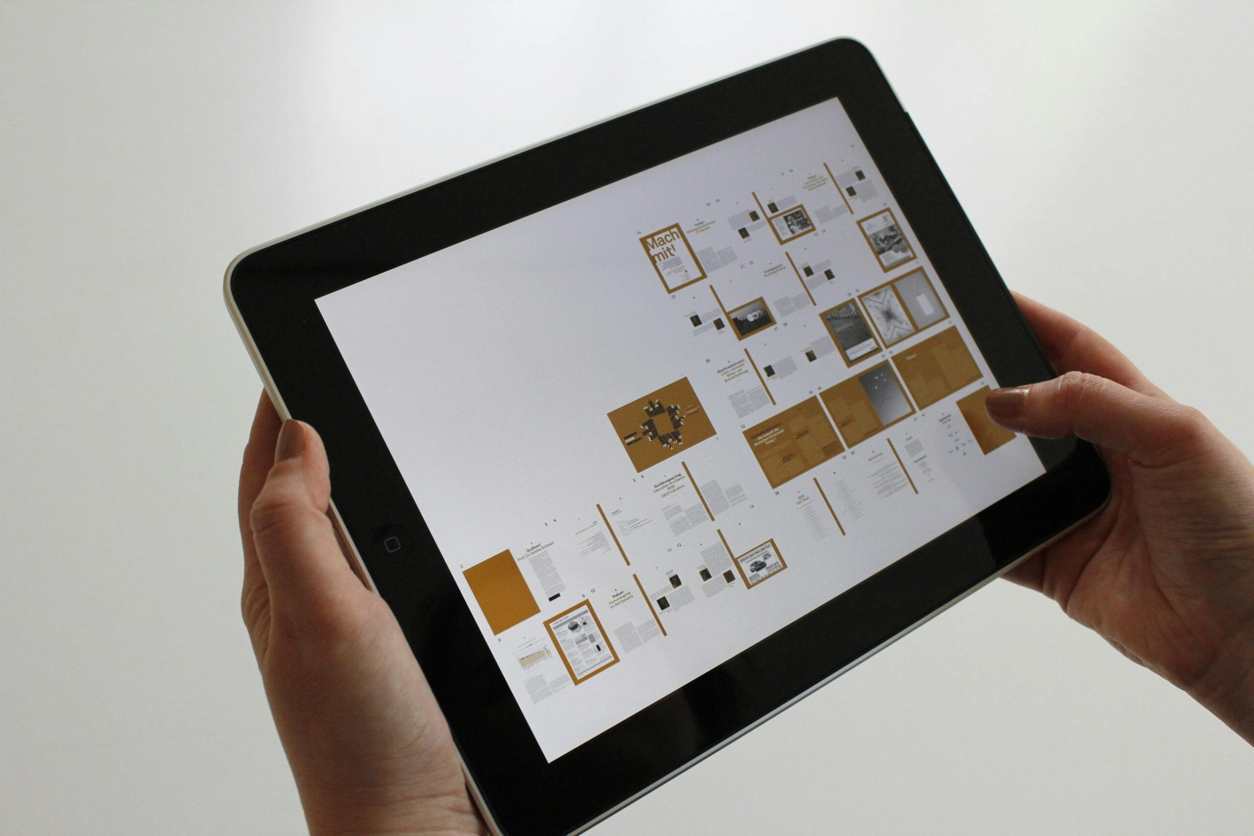
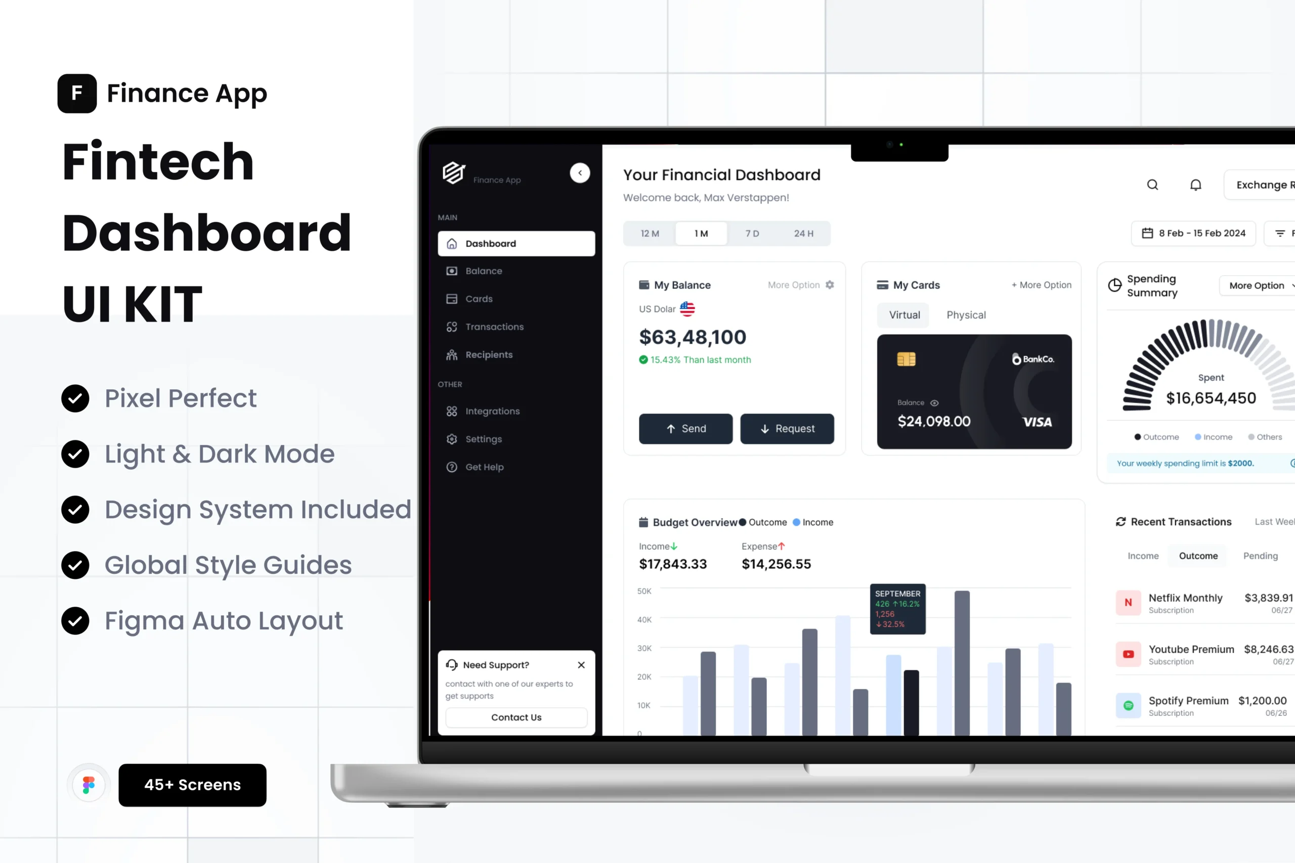
You’ve designed a stunning app interface or a beautiful mobile website. But presenting it as a flat image on a white background doesn’t do it justice. This is where mobile mockups come in—they are the secret weapon for showcasing your work in a realistic and compelling context. However, using them correctly is key to a professional presentation.
A mockup is a model or a template that allows you to display your design on a device screen. Used well, it can elevate your portfolio, impress clients, and win projects. Used poorly, it can look cheap and distract from your work.
Here’s how to use mobile mockups correctly:
1. Choose Contextually Relevant Mockups.
The best mockups enhance the story of your design. Is it a fitness app? Show it on a phone in someone’s hand at the gym. Is it a financial dashboard? Display it on a phone resting on a desk next a coffee cup. The environment should make sense and help the viewer imagine using the app in real life. Avoid overly dramatic or irrelevant scenes that steal the focus.
2. Keep the Focus on Your Design.
The mockup is a frame, and your design is the artwork. Don’t let the frame overpower the art. Avoid mockups with heavy shadows, intense reflections, or extreme angles that distort your screen. The goal is realism, not artistic flair that makes your UI hard to see. The viewer’s eye should be drawn to your app’s interface, not the shiny bezel of the phone.
3. Master the Technical Details.
-
Perspective & Warping: When you place your design onto a mockup, ensure it follows the perspective of the screen naturally. Use Photoshop’s “Smart Object” feature or similar tools in other software to warp and blend your design seamlessly. It should look like it’s truly part of the device, not just pasted on top.
-
Screen Brightness: Adjust the brightness and contrast of your screen design to match the lighting of the mockup. A bright, flat design will look out of place on a mockup set in a dimly lit room.
4. Show Key Interactions and Flows.
A single static screen is good, but a series of mockups showing a user flow is great. Use multiple mockups to demonstrate how a user would navigate from the home screen to a product page, or through a checkout process. This tells a much more powerful story about the functionality and user experience of your design.
The Bottom Line:
A mobile mockup is a tool for storytelling. Its purpose is to build context and credibility for your work. By choosing the right scene, keeping the focus on your UI, and paying attention to technical details, you can transform a good design presentation into an exceptional one that truly resonates with your audience.