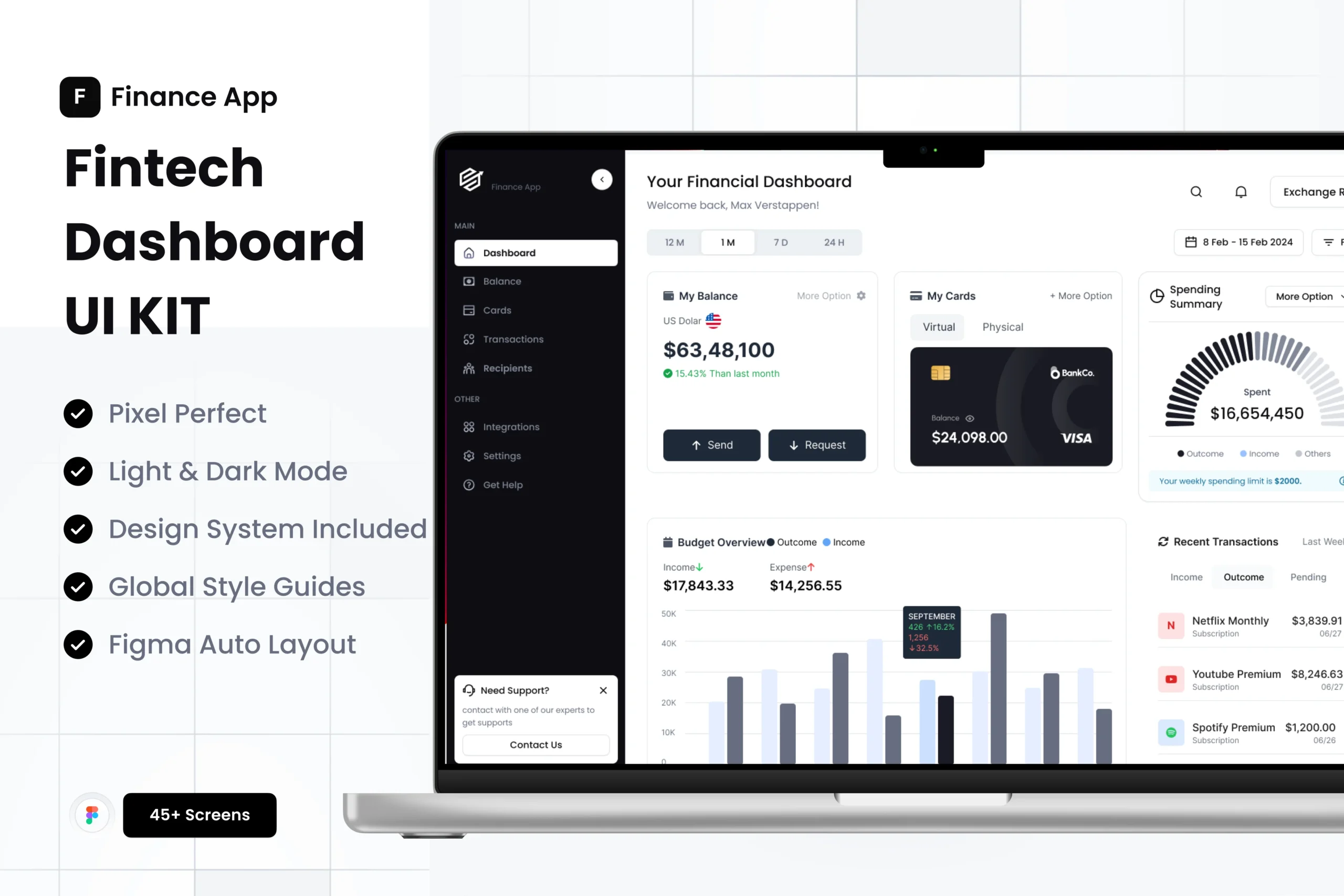
Fintech Dashboard UI: KPIs, Card Patterns, and Table Design (Figma Guide)
Designing a fintech dashboard is a balance of clarity, trust, and speed. In this guide, we’ll cover the KPIs that matter, proven card patterns, and table UX that scales—plus Figma-ready tips to ship faster. If you want a head start, explore our production-ready kit: Fintech Dashboard UI Kit | Banking Web App
The KPIs that actually matter
- Account balance and net worth: Show current, change vs. previous period, and trend.
- Cash flow: Inflow, outflow, burn rate; highlight anomalies.
- Transactions health: Approval rate, declines, chargebacks.
- Revenue and growth: MRR/GMV, ARPU, cohort growth, churn.
- Lending risk: NPL ratio, PD/LGD proxies, DPD buckets.
- Operational: Ticket backlog, SLA compliance, uptime.
Design notes: show period selector; add sparklines with color semantics; use consistent currency formatting; support multi-currency.
Card patterns that improve scan speed
- Summary cards: Big number, short label, delta (+2.3% WoW), miniature trend.
- Segmented summary: Tabs for Accounts/Cards/Wallets; each tab swaps a small set of KPIs.
- Actionable cards: “Verify KYC,” “Complete transfer,” “Add card”—with primary CTA.
- Risk alerts: Elevated declines, unusual spend; include severity, time window, link to details.
Figma tips: use Auto Layout and tokens; define variants for sizes (S/M/L) and states (default/alert/disabled).
Tables users don’t hate
- Frozen headers, horizontal scrolling for wide schemas.
- Dense mode toggle; 12–14px font; zebra rows; 44px min row height on touch.
- Column utilities: Sort, filter chips, saved views, column visibility, CSV export.
- Inline actions: “Refund,” “Hold,” “Details” as right-aligned actions; batch actions for multi-select.
- Empty, loading, and error states designed up-front.
Accessibility: visible focus, minimum 4.5:1 contrast, row/column headers with proper semantics when coded.
Layout and information architecture
- Left nav for domains (Overview, Accounts, Cards, Payments, Risk).
- Overview as an executive blend of KPIs, recent transactions, and alert feed.
- Detail pages with summary header, filters, key table, and right-side insights.
- Global search with entity shortcuts (txn:, user:, card:).
Performance: defer heavy charts; prioritize first contentful elements; keep hero imagery light.
Design tokens and theming
- Color roles: success, warning, danger, info—map to brand palette with clear contrast.
- Spacing scale (4/8/12/16/24).
- Chart theming: 6–8 categorical colors; light/dark contrast tested.
- Number formatting: consistent decimals, currency symbol placement, locale awareness.
Ship faster with a ready system
If you’d rather customize than reinvent, start with the Fintech Dashboard UI Kit | Banking Web App. It includes 45+ screens, Auto Layout, dark/light themes, and reusable components so you can focus on product logic—not pixel chores.
FAQs
What KPIs should a fintech dashboard start with?
Balance, cash flow, approval/decline rate, revenue/GMV, churn, and key risk alerts.
Cards vs. tables—when to use each?
Cards for glanceable KPIs and actions; tables for investigation, sorting, and bulk work.
How do I keep dashboards fast?
Lazy-load heavy charts, memoize data transforms, and limit first paint to essentials.
How should I handle dark mode?
Use role-based tokens, not raw hex; validate chart contrast; avoid pure black backgrounds.
Can I adapt this to banking and wallets?
Yes—swap domain labels and metrics; the UI patterns remain the same.
Ready to accelerate your delivery? Get the Fintech Dashboard UI Kit | Banking Web App and customize in minutes.