Have you ever opened a dashboard and felt instantly lost?
Tiny charts, random widgets, a flood of colors — it’s like staring at an airplane cockpit with no flight manual.
Good dashboards don’t do that. They guide you. They let you find what matters in seconds.
And that’s exactly what great UX is about — turning complexity into clarity.
In this post, I’ll share a few practical lessons on how to design dashboards that feel effortless, based on patterns I’ve seen in real projects and templates we’ve refined at UISea.
1. Start With What the User Actually Cares About
It’s easy to design around data, but real users think in goals.
A sales manager doesn’t want “Revenue by Region (Q3)”; they want to know “How are we performing this week?”
Before you move a single pixel, ask:
Once you know that, everything else — layout, color, typography — falls into place naturally.
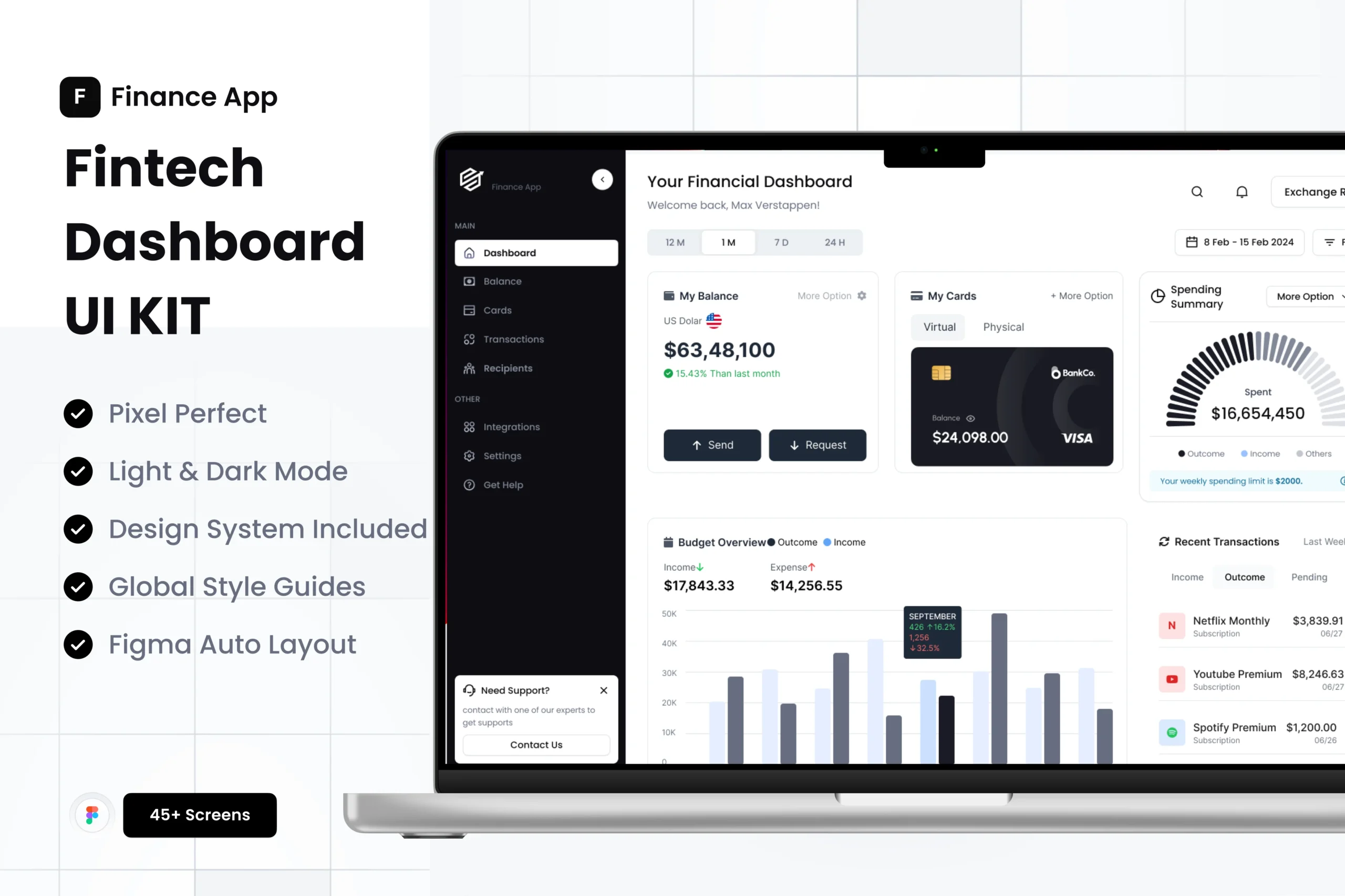
(That’s why our CRM Dashboard UI Kit puts key metrics front and center — no hunting, no guessing.)
2. Use Hierarchy, Not Decoration
A clean dashboard doesn’t mean a dull one.
It means every element has a clear reason to exist.
Try this quick exercise:
-
Squint at your design.
-
Notice which area your eyes go to first.
If it’s not the most important piece of data, something’s off. Adjust font sizes, color contrast, or spacing until the hierarchy feels right.
3. Turn Numbers Into Stories
Charts are powerful, but too often they’re just noise.
A dashboard should help people see what’s changing and why it matters.
When choosing visuals:
-
Use a line chart for trends.
-
Use a bar chart for comparisons.
-
Keep color palettes calm — let the data breathe.
And remember: white space is your best friend. It gives meaning to what’s on screen.
4. Think Beyond the Desktop
Not everyone views dashboards from a 27-inch monitor.
A support agent might use a tablet. A founder might check analytics on their phone.
Design for real situations — not perfect ones.
That’s why every UISea kit uses responsive grids and flexible components, so layouts stay consistent wherever they’re viewed.
5. Give Users Just Enough Control
Personalization can be a double-edged sword.
Too much, and you confuse users; too little, and the dashboard feels rigid.
Offer gentle customization:
-
Let users pick favorite metrics.
-
Save their preferred view.
-
Keep filters simple and visible.
A dashboard that feels “yours” is one you’ll come back to.
Final Thoughts
Great dashboards don’t shout. They whisper.
They quietly surface the information that matters most and help users feel confident, not confused.
If you’re working on a CRM, analytics app, or SaaS platform, start with solid building blocks. Templates like our CRM Dashboard UI Kit (70+ Screens for Figma) can give you a head start — but it’s your UX decisions that make it truly shine.
Design for clarity. Design for calm.
That’s how dashboards become effortless.