
In the rapidly evolving landscape of digital design, efficiency without compromising quality has become the holy grail for designers worldwide. UI kits have emerged as indispensable tools that bridge the gap between speed and excellence, enabling designers to deliver professional-grade interfaces in a fraction of the time traditional methods require.
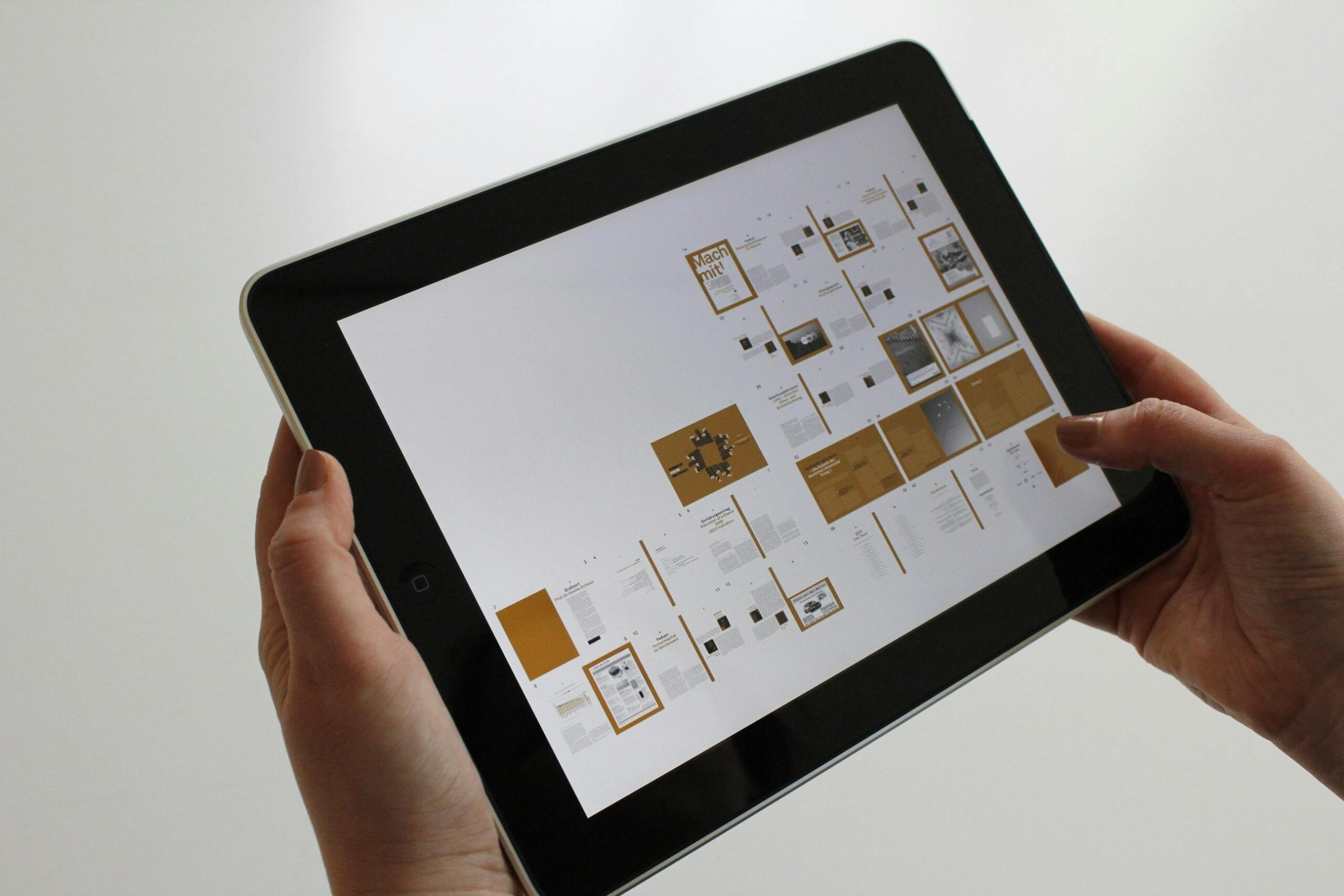
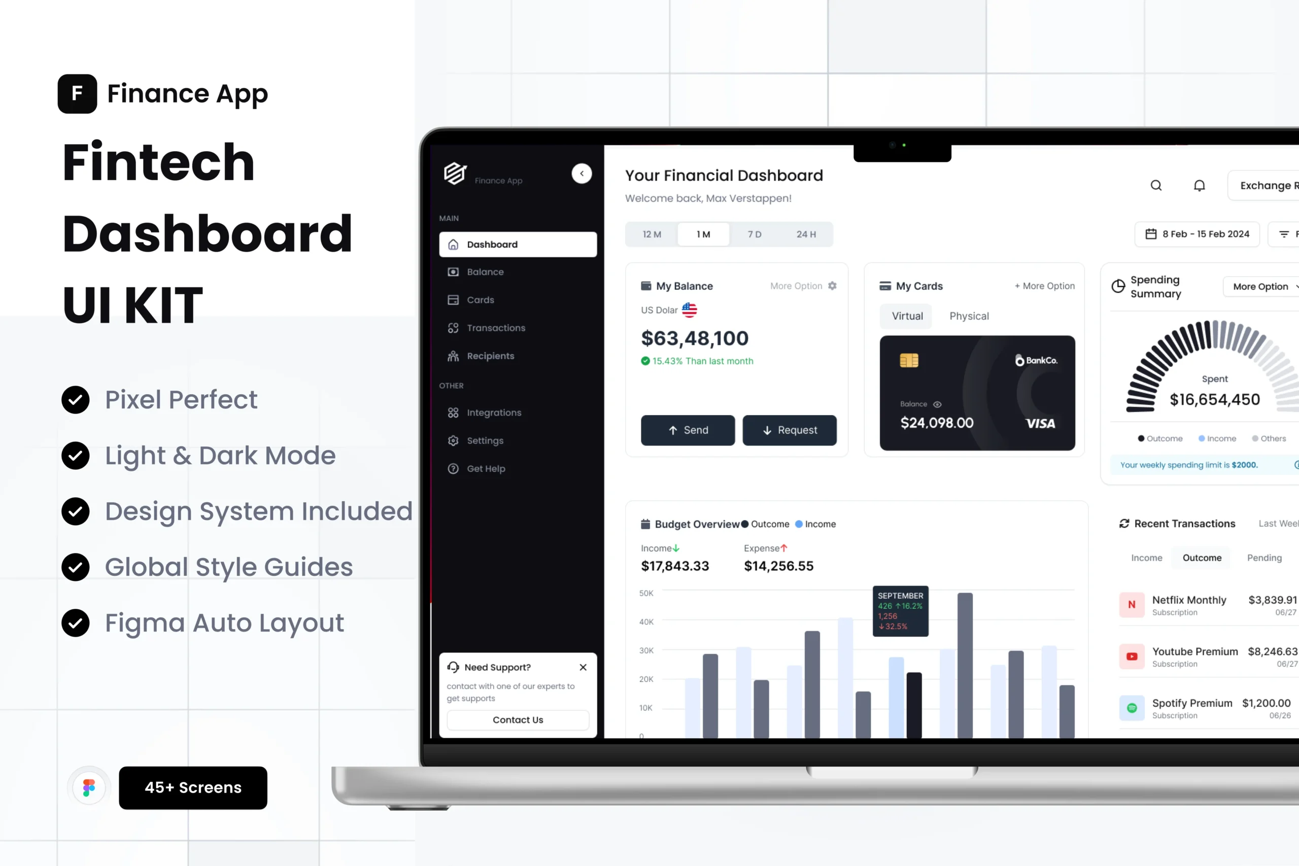
UI kits are comprehensive collections of pre-designed user interface components, patterns, and elements that designers can leverage to build digital products quickly and consistently. These curated design systems include everything from buttons, forms, and navigation bars to complex components like data tables, modals, and card layouts.
The significance of UI kits extends beyond mere convenience. They represent a fundamental shift in how modern design teams approach product development. By providing ready-made, professionally crafted components, UI kits allow designers to focus their creative energy on solving unique user experience challenges rather than reinventing common interface patterns.
The design community has witnessed a remarkable transformation in how resources are created and shared. Early designers relied heavily on building every element from scratch, which was time-consuming and often led to inconsistencies across projects. As the industry matured, pattern libraries and style guides emerged, laying the groundwork for today’s sophisticated UI kits.
Modern UI kits incorporate design system principles, ensuring that every component works harmoniously together. They reflect current design trends, accessibility standards, and platform-specific guidelines, making them invaluable for creating interfaces that feel both contemporary and user-friendly.
The most immediate advantage of incorporating UI kits into your workflow is the substantial time savings. Instead of designing common components repeatedly, you can select pre-built elements and customize them to match your project requirements. This acceleration is particularly valuable when working under tight deadlines or managing multiple projects simultaneously.
Maintaining visual and functional consistency throughout a digital product is crucial for user experience. UI kits ensure that buttons behave the same way, typography follows consistent hierarchies, and spacing adheres to predictable patterns. This uniformity creates intuitive interfaces where users can build mental models and navigate confidently.
Premium UI kits are crafted by experienced designers who understand the nuances of effective interface design. They incorporate best practices in visual hierarchy, color theory, and user interaction patterns. By leveraging these professionally designed components, even less experienced designers can produce work that meets industry standards.
Well-constructed UI kits are designed with scalability in mind. As your project grows and evolves, the component-based approach allows you to add new features while maintaining design cohesion. This modularity proves invaluable for long-term product development and team collaboration.
When design and development teams work with the same UI kit as their source of truth, communication improves dramatically. Developers can reference specific components, designers can articulate changes more precisely, and stakeholders gain clearer visibility into the design direction. This shared language accelerates the entire product development cycle.
A robust UI kit serves as a complete design system that addresses diverse interface requirements. Understanding what to look for helps you select resources that truly enhance your workflow.
The building blocks of any interface include typography systems with clearly defined hierarchies, comprehensive color palettes with accessibility considerations, spacing and layout grids that ensure visual consistency, and iconography that communicates clearly across cultural contexts.
Forms and input fields with various states, button variations for different contexts and priorities, navigation patterns including menus and breadcrumbs, and modals and overlays for focused user interactions form the interactive core of modern interfaces.
Advanced UI kits provide data visualization components, dashboard layouts and widgets, onboarding flows and empty states, and e-commerce elements like product cards and checkout flows. These sophisticated patterns address specific use cases and significantly accelerate specialized project types.
Modern UI kits must account for the multi-device reality of today’s digital landscape. Look for kits that include mobile, tablet, and desktop variations, with components that adapt gracefully across breakpoints and maintain usability regardless of screen size.
Selecting an appropriate UI kit requires careful consideration of several factors that align with your specific needs and workflow.
Ensure the UI kit works seamlessly with your preferred design software, whether that’s Figma, Sketch, Adobe XD, or another platform. Native compatibility prevents conversion issues and maintains component functionality like auto-layout and component properties.
The visual style of your chosen UI kit should align with your brand guidelines or project aesthetic. While customization is always possible, starting with a kit that’s closer to your target aesthetic saves considerable adaptation time.
Comprehensive documentation separates exceptional UI kits from mediocre ones. Look for resources that explain component usage, provide implementation guidelines, and offer examples of different component combinations. Quality documentation accelerates your learning curve and prevents misuse of components.
Understanding licensing terms is crucial, especially for commercial projects. Verify whether the UI kit allows client work, requires attribution, or has restrictions on redistribution. Clear licensing prevents legal complications down the line.
UI kits backed by active communities offer tremendous value beyond the components themselves. Access to forums, regular updates, and responsive creator support can make the difference between a smooth experience and a frustrating one.
Simply downloading a UI kit doesn’t guarantee success. Thoughtful implementation strategies maximize their value while avoiding common pitfalls.
While UI kits provide excellent starting points, customization ensures your final product feels unique and aligned with your brand. Focus customization efforts on high-visibility elements like color schemes, typography, and key interaction patterns, while maintaining the structural integrity of well-designed components.
As you work with UI kits, respect the underlying design system logic. If the kit uses eight-pixel spacing increments, continue that pattern in your custom elements. Consistency in these fundamental decisions creates cohesive user experiences.
When adapting UI kit components for specific needs, document your changes and rationale. This practice proves invaluable when onboarding new team members or revisiting projects after time away. Clear documentation ensures your customizations become part of an evolving, maintainable design system.
Rather than repeatedly importing individual components from the original UI kit, establish a project-specific component library. This approach centralizes your customized versions, making updates more manageable and ensuring consistency across your design files.
Components that look perfect in isolation may reveal issues when combined in actual interface layouts. Regularly test your UI kit components in realistic scenarios with actual content to identify and address any practical limitations or conflicts.
Even experienced designers can fall into traps that diminish the value of UI kits.
Blindly using components without understanding their purpose or proper implementation leads to poor user experiences. Take time to understand why components are structured as they are and when specific patterns are most appropriate.
Not all UI kits prioritize accessibility equally. Verify that components meet WCAG guidelines for color contrast, keyboard navigation, and screen reader compatibility. Accessibility should never be an afterthought in modern design practice.
Combining elements from multiple UI kits without careful consideration creates visual dissonance and inconsistent interaction patterns. If you must draw from multiple sources, invest time in harmonizing styles and behaviors.
Desktop-focused designers sometimes overlook mobile-specific challenges. Ensure your UI kit implementation translates effectively to smaller screens with touch-friendly target sizes and appropriate information hierarchy adjustments.
The trajectory of UI kits points toward increasingly sophisticated and specialized resources. Artificial intelligence integration promises UI kits that adapt components based on usage patterns and user feedback. Design tokens and code-based design systems are blurring the lines between design and development, enabling more seamless handoffs and greater consistency.
Specialized UI kits targeting specific industries, use cases, or emerging technologies continue to proliferate, giving designers access to highly relevant starting points for niche projects. This specialization trend accelerates as design patterns mature in newer domains like augmented reality, voice interfaces, and Internet of Things applications.
To extract maximum value from UI kits, approach them as learning resources as well as productivity tools. Study well-crafted components to understand design decisions, spacing choices, and interaction patterns. This analysis sharpens your design judgment and informs future work.
Participate in communities around your chosen UI kits. Share your implementations, learn from others’ experiences, and contribute feedback that shapes future iterations. This engagement transforms passive consumption into active participation in the evolving design ecosystem.
Consider creating your own UI kit components to supplement commercial resources. This practice ensures you can address unique project requirements while maintaining consistency with your established design language. Personal component libraries become valuable assets that grow more useful with each project.
UI kits represent more than shortcuts or efficiency tools—they embody accumulated design wisdom and best practices that elevate entire projects. By thoughtfully selecting, customizing, and implementing these resources, designers can focus their creative energy where it matters most: solving unique user problems and crafting delightful experiences.
The key lies in viewing UI kits not as replacements for design thinking but as foundations that support and accelerate it. When used strategically, they become catalysts for better work, enabling designers to deliver exceptional results consistently and efficiently.
As you integrate UI kits into your workflow, remember that the goal isn’t to eliminate the design process but to optimize it. The time saved on common patterns becomes time invested in research, iteration, and refinement—the activities that truly differentiate outstanding design from merely adequate solutions.
Ready to transform your design workflow? Explore our curated collection of premium UI kits and design resources at UISea, where quality meets efficiency in every component.
Keywords targeted: UI kits, UI design, UX design, design workflow, user interface, design systems, UI components, design resources, interface design, design efficiency


WhatsApp us